Branding Case Study: Graslok
I recently had the opportunity to design a brand identity. I'm working on a project with Lukas, an excellent co-conspirator and the need arose: Unlike traditional corporate branding projects where many heads are involved, I had the chance to rapidly prototype a brand identity with little overhead; speed is everything when working on a Minimum Viable Product (MVP).
In this post, I outline the visual branding design process I used to achieve this.
Rapid Design
I found this to be one of the most helpful 'platitudes' in design when it comes to generating results on a deadline:
The issue is rarely too little 'good' design options but rather an overwhelming amount of arbitrary choices for design elements, that make a design process challenging.
The path of least resistance in design is usually the fastest, focussing on making decisions fast.
Simply put: You start a jigsaw puzzle by putting together the easiest parts first and hope the rest reveals itself to you on the way.
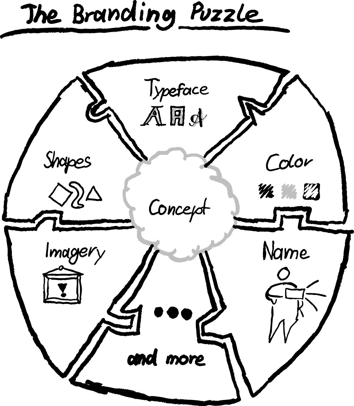
Let's put the first piece down!
Concept: Expressing The Project
Every good design process starts with intention: What am I designing around? The project is nowhere near finished and the idea will change with product iterations, but the basic pitch is:
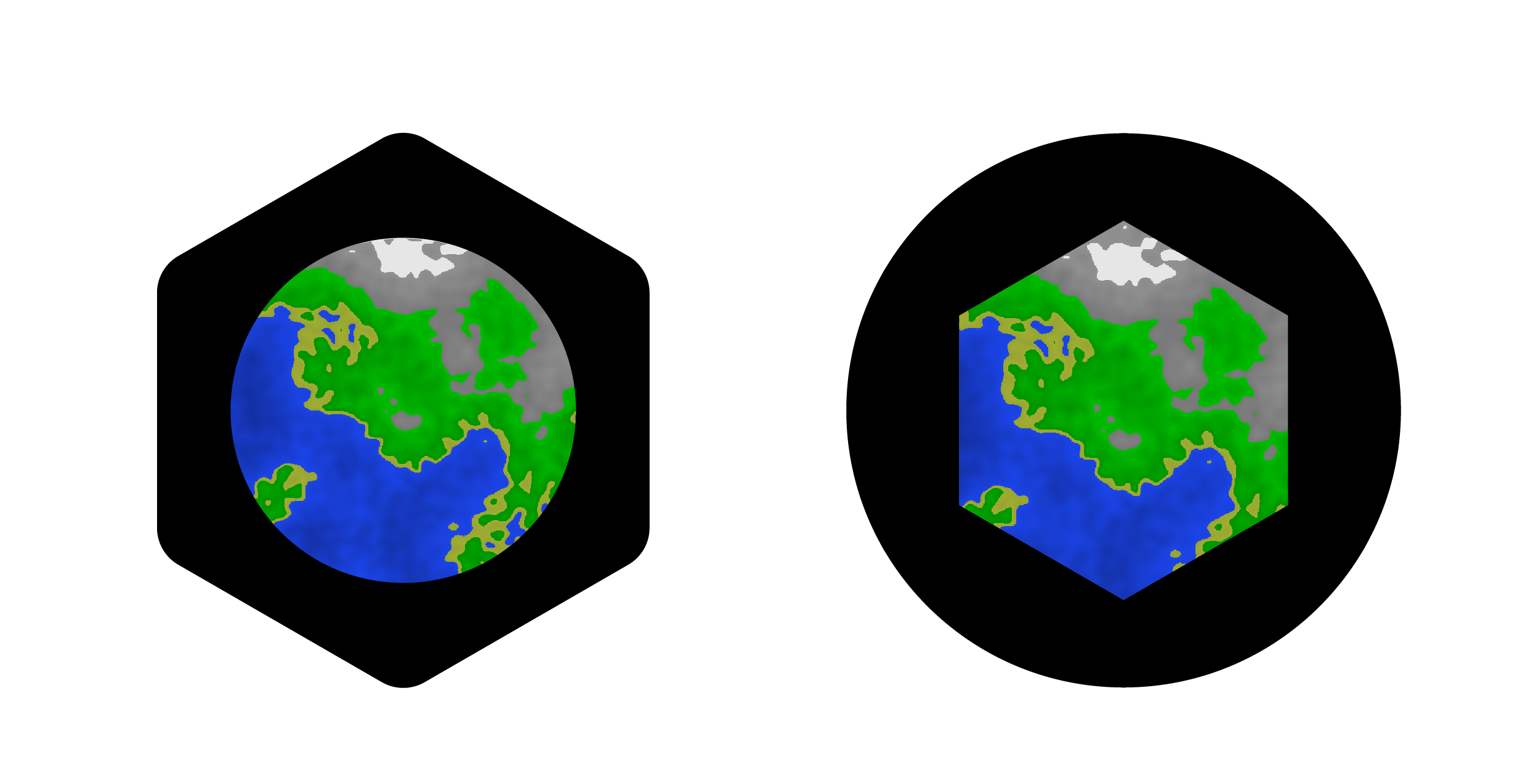
Imagine an very large, simple, generated world that is accessible and manageable through an open infrastructure. You can request a Maps-style view of any part of this world.
Keeping the branding generic ensures that the brand identity does not feel 'outdated' with later product iterations that might deviate from earlier ideas and keeps design turnaround times low.
Name
The project being a web application, locking the desired .com was a prerogative (and, of course, being able to name the project repositories accordingly). Available .com domains being rare, this was a good starting point.
Working around the basic pitch we brainstormed for names:
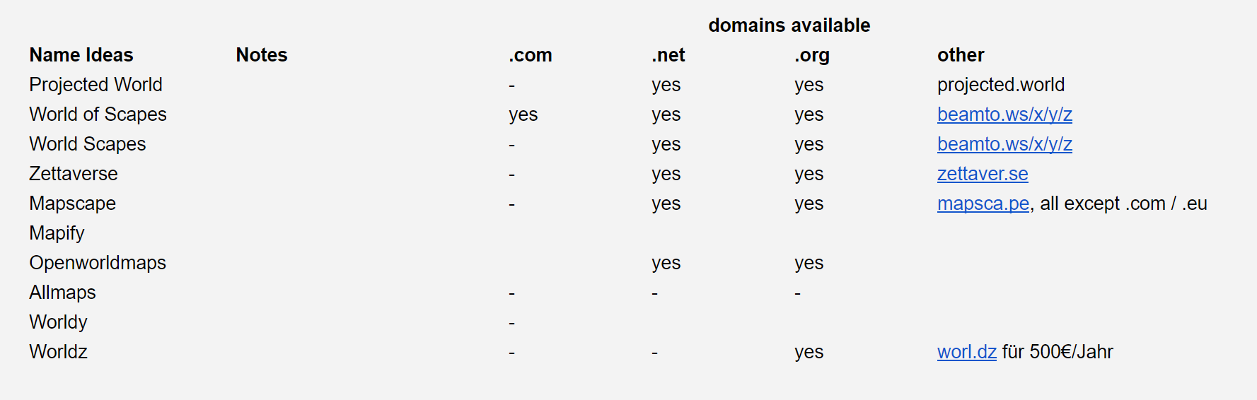
None of the context-based ideas helped much, so we went crazier with the names. Eventually, we hit a nice sounding available name with little meaning attached, perfect for generic branding and a blank canvas project like this:
graslok.com
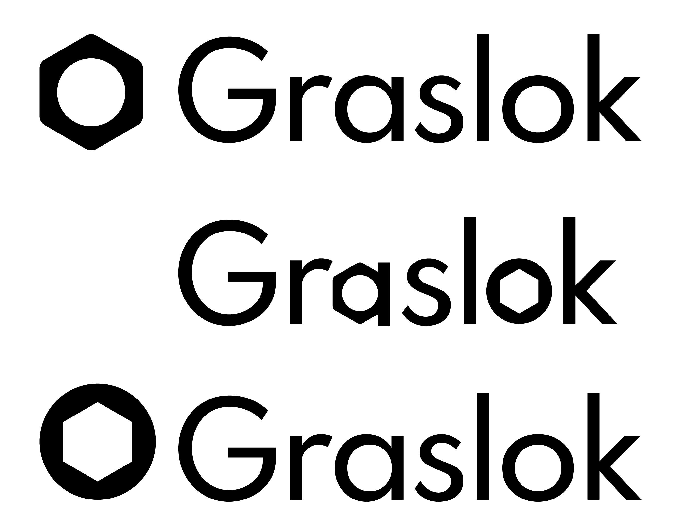
Five minutes later the domain name is claimed and the first tangible branding element is chosen: Graslok
Font
Deciding on a font is another quick-win jigsaw piece, as technical requirements limit this choice:
- Open License Type (no budget for licenses)
- Readability
- No Serifs, 'clean'
- Not a font that is already used by a major player or heavily used (e.g. Helvetica)
Going through the font platform of my choice, I played around with options.
I decided on Spartan early as it fits all the criteria and I liked the versatile font weights.

Off to the next puzzle piece!
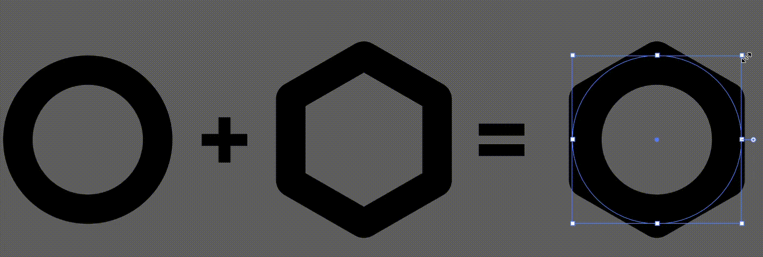
Two Core Shapes & Logo
I want to keep the branding generic. Clean shapes would be easy to work with. Two shapes stood out to me early:
- Circle: Round as a world globe, a universal form for 'completeness'
- Hexagon: If you have not seen CGP Grey's Love Letter To Hexagons, I wholeheartedly recommend it. Its' tiling properties make it a very elegant shape fit for this project; on a more technical level, Graslok makes heavy use of tiling.

The focus here is not having the best possible options but one fast and effective solution. These shapes I already had floating around my head are a great and flexible basis for many designs. So instead of waiting for a better idea to come, I head to Illustrator.
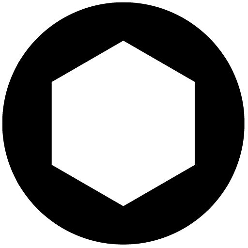
Playing around with these shapes, I had a fun realization:
This is good enough to be used and is another piece of the branding puzzle solved. I can quickly render a first concept loading animation in After Effects to sell the branding pitch:
This is progress:
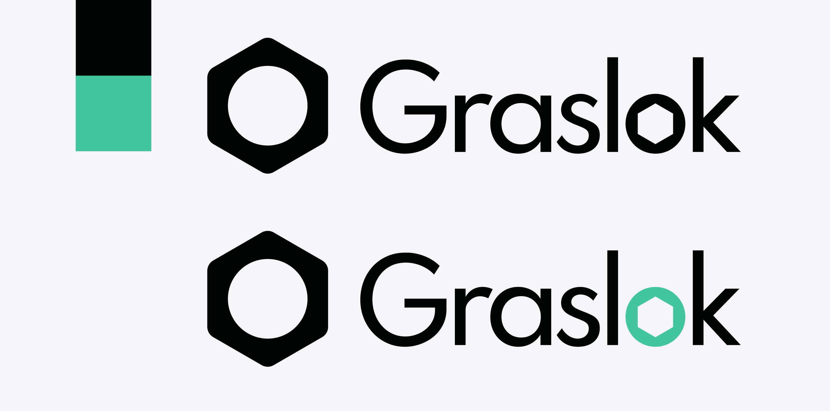
Colours
Colours are a necessary part of every branding and enough has been said about how to interpret them. Trying to keep the branding generic and the look simple, I decide to go with Grayscale + Accent Colour for simplicity's sake.
To identify the exact colour scheme, I play around with different options. I enjoy using Coolors as a prototyping tool for this: I try multiple variations of my grayscale/accent idea as well as some of the tool's generated, wildly different colour schemes to test my idea against.
And with that, I'm can compose the branding:
Where to go from here
The MVP objective is fulfilled: The branding is now good enough to decorate a shippable product. From here the branding can evolve with the rest of the project. From small changes to colours to additions to reworks; a lot of updates can be made in later stages of the project.
But for now, this is good enough for me to get back to the more laborious task of writing its code. Unfortunately, there are fewer corners I can cut in that regard.